
Ranter
Join devRant
Do all the things like
++ or -- rants, post your own rants, comment on others' rants and build your customized dev avatar
Sign Up
Pipeless API

From the creators of devRant, Pipeless lets you power real-time personalized recommendations and activity feeds using a simple API
Learn More
Comments
-
@Gerrymandered Appreciate the enthusiasm! Going to work on the CMS (aka the backend/api for now) right now so I hope the first version will be available in max a week or so?
@ThoughtfulDev So that would make that if there's a lot of pro's/cons, you could scroll through those you mean? -
 edensg7728yAside from the alignment, it looks alright! One thing I'd personally want to address is that there are a lot of widows — lines with only a single word at the end of a paragraph of text.
 -
 lo98be6128y@ThoughtfulDev I wouldn't, it makes more clearly visible the best ones and the bad ones
 -
edensg7728y@linuxxx regarding making the pros/cons the same height, I believe @ThoughtfulDev is referring to the fact that the red and green containers could be the same height, no matter the number of pros/cons
-
Hi!
I'm not aware of the full scope of your project (so far I've seen OS and IM apps), so I'm not quite sure if the following applies:
Have you considered an indicator about easy of use/setup in the details of the app? -
@araxhiel Nope not yet but good one!
And this site will be one on which you can see comparisons between proprietary/non privacy friend and open/privacy friendly applications/services :).
@edensg Yeah gotya :). I'll add that to the to-do list!
Also, my devRantron crashes about every new notification (I get a lot of those) so I can't catch up with every comment :P -
Since pros and cons are subjective, maybe add a section for people to leave pros and cons for each app and they will appear with the same format.
Also, too much white space. I'm wondering how it looks on a high resolution monitor.
For the future, when you will have a larger database of apps you can add an option to find similar apps, maybe with the same "pros" and without the "cons". -
@CoffeeAndHate Thanks, will keep those in mind!
@UnknownDev Define cards please?
@ThatDude Frontend is not my no1 priority at the moment but yeah want to make it more pretty anyways :) -
@AlexDeLarge im not sure if i want to like your comment or not. I mean yeah it stinks bootstrap but then its clear and neat. But ehat the hell, ill ++ for honesty ;)
-
Have the list within the boxes makes it too much imom probably jusst bullet points. Also you coupe probably have 3 columns insteaad of. 2 and keep the links with the app description (col 5 5 2) something like that.
Also the colors are the stinky bootstrap part from my previous comment ;) -
Maybe you should use some base like bootstrap to get easier mobile optimization and the alignment right 😃
edit: reading into the thread bit more it seems like youre using it already - why is the alignment like that then though? -
@AlexDeLarge all good ;) before entering thr dev world the few hardcor devs that i met were honest loyal good hearted assholes ;) usually fatalistic as well ;) and i say that with love. My good friend who is teaching me dev is like that.
-
@AlexDeLarge No offense taken! I personally like it but yeah slowly looking into getting another frontender involved :)
-
@SauceBoss That's nonsense but if you rephrase it to 'most regular users don't care about privacy' then you'd be right :). No offense!
-
@linuxxx you should really make the website's repo public and create issues there for discussions like these.
You're always talking about how much you like open source software, but for some reason you seem afraid to share this with the community.
I know you're still starting it and the code is probably a mess right now, but we know you're not a frontend person, so we won't judge, and it looks like you could use the help. -
@shellbug I'm not afraid about that haha! I made clear at the beginning that the code will be made public once the first release is in the air :)
-
@DoubleAngels Fuck IE with a rusty pipe with spikes dipped in veeeeeery hot sambal!
-
@bas1948 looks better (not too much a fan of the second backgroundcolor, love linuxxx white simple background more), but the header 😥
-
 ace4810018y@JoshBent @linuxxx
This was actually done in a rush, I also think the main background is too dark.. Didn't put much effort into the header as my intention was to give you an idea of a cleaner design.
I would also change the default colours while at it.
I might give a helping hand when it's open source.
Good luck mate. -
-
@linuxxx but why the screenshot of signal? placeholder?
also what is the privacy app? tell me more... -
@linuxxx I guess that he's talking about your first post: "Working on the privacy app..."
-
@0x412E2047696C @CozyPlanes Right. Developing a site which compares apps/services on mostly privacy level :)
-
@kurtr "This debug view expired.
If this is your Pen or you are PRO, log in to view it in debug mode.
Never want to see this message again? Go PRO!PRO members' Pens get unlimited debug views, and PRO members can see any Pen in debug mode." -
 kurtr124728y@JoshBent Shit, that's new sorry about that. Here you go https://codepen.io/kurtr/full/...
 -
kurtr124728y@JoshBent It's not ad placement, it's brand association. Let's be honest - no one riots or even bats an eye if a mom n pop business violates privacy (hair dressers sharing contacts etc) because there is much worse going on on a much grander scale. These companies spend millions each year to get you to associate their logo / brand with their business to make it easier for you to associate the next slogan or buzz word they throw on an ad faster even when the ad says less.
Brands are a double edged sword that way because it's just as easy and quick for you to associate something negative with them. To use car manufactures as an example, if I rattle of a bunch of their names to my girl friend she will only be able to identify a few of them with the correct product but if I show her a list of their badges she will immediately tell me they all make cars.
Correct logo's & panetones should always be used when available if you want a clear message. -
@kurtr I read your second comment now multiple times and it still doesn't make any sense to me why one would include an ad into a design, why would he want his site to be associated with dropbox?


Related Rants
-
 linuxxx71This guy at my last internship. A windows fanboy to the fucking max! He was saying how he'd never use anythi...
 -
linuxxx96It was between me and another guy. I fucking won! I GOT THE FUCKING JOB!! I'll be a junior Linux Support...
-
 dfox51
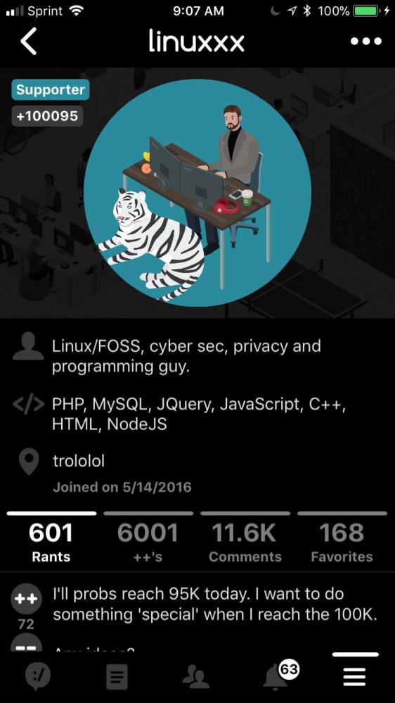 Huge congrats to @linuxxx for being the first ever member of the devRant community to reach 100,000++
This is...
Huge congrats to @linuxxx for being the first ever member of the devRant community to reach 100,000++
This is...
Hai devRant! Working on the privacy app and want opinions on the page for details on specific apps (as in, applications so web/app/mobile or even embedded?!).
Yeah I know that the aligning is deffo not perfect but hey, gotta start somewhere :). Detail: everything you see here (the content and actually also the icon path) is rendered from the database already.
Tips/opinions?
undefined
thankies
linuxxx
privacy site
opinions please
tips please