
Ranter
Join devRant
Do all the things like
++ or -- rants, post your own rants, comment on others' rants and build your customized dev avatar
Sign Up
Pipeless API

From the creators of devRant, Pipeless lets you power real-time personalized recommendations and activity feeds using a simple API
Learn More
Comments
-
-
 cdrice41838yHahaha, you know your users well - That black theme is enough to drive the ++ membership through the roof! 😎
 -
 C0D4644188yHoly shit, a black theme that actually works well 😍😍😍😍😍😍
God I love this place 😎
@trogus only small issue i have is a needed spacer / dividing line between rants in the list view so they are visually separated
Otherwise 😍 -
 trogus130638y@calmyourtities the filtering isn't built yet, we wanted to collect some categorized content first. Will look like attached, another row for the filter/sort expanding menu
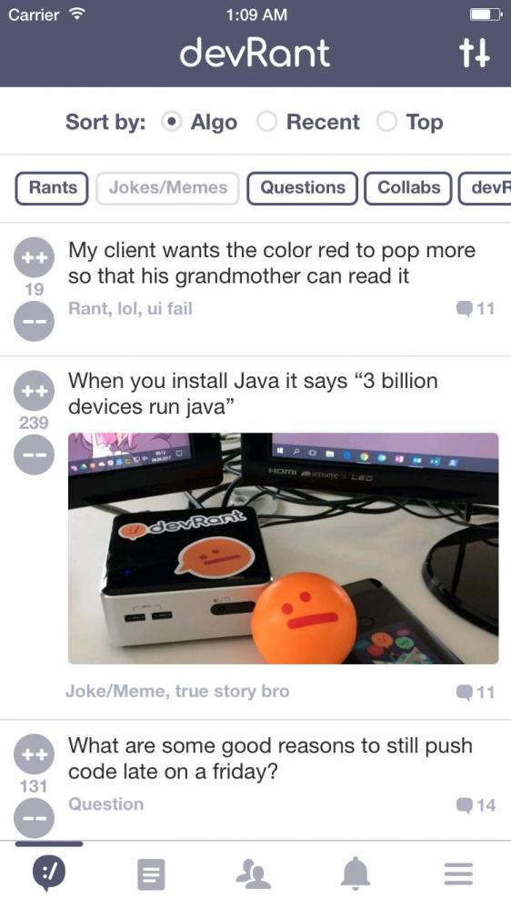
-
trogus130638y@C0D4 yeah, I was on the fence about those. I started with them in and then cut them out to look sleeker, but has some usability issues. I might slip them in next release
-
Since the rant/story button is twice as big as the others, shouldn't ++s be worth double? You know, it triggers an operator overload or whatever.
This is devRant, after all. -
Damn... that black theme looks so sexy. If I had money I'd support happily but fuck, I'm about to steal some to get that sweet sweet theme.
-
 Skayo79588y<@trogus> <@dfox>
If collabs are free now, can you add an option to filter collabs?
I'll also create an issue for this.
Oh and thanks for the awesome dark theme! -
 dfox421568yThanks for the great feedback everyone, we appreciate it!
@Skayo what do you mean exactly? If you take a look at the pic @trogus posted above, soon you’ll be able to filter on any post type. Not sure if that’s what you mean though. -
Skayo79588y<@dfox>
An option to filter collabs by popular/recent and project type (project idea, new project, ...)
Just like for rants. -
dfox421568y@Skayo ah, I mean I think that will have to work be default once we add the filtering by type capability.
-
trogus130638y@Skayo Once filters are live in the next few weeks, you will be able to turn on or off any combination of post types. So if you only wanted to see Collabs or only Questions, you could turn on only those types. Alternaively, if you only wanted to not see joke/memes, you could leave all other types on, and just turn off that one type.
-
@fbricenho I know what you mean. But after trying it for a bit it has definitely grown on me
-
trogus130638y@Oyveloper ducks will be ready soon, I'm still experimenting with cape fabrication techniques, but getting close
-
 Eariel18928yI love that theme. It's a pity the Play Store pop-up is still showing my other user and doesn't let me change it.
 -
 Jamers99248y@AlgoRythm @maryn I've had it on my windows phone since the beginning... And the ability to fully customize any color that exists. Third party devs are the best.
 -
@trogus is gonna win a stress ball soon. And he may need it with all the requests.
-
@AlexDeLarge I can only see two buttons under settings though, "Log Out" and "Delete Account".
-
dfox421568y@TerriToniAX on the menu tab, there should be a banner at the top. Please let us know if you’re able to see that, thanks!
-
@dfox What menu tab? I can't see a menu tab neither. I can see a menu though and that opens up as an overlay in a lightboxy sort of manner. There's no banner there.
-
dfox421568y@TerriToniAX what platform are you on? Web? devRant++ is only available on the mobile apps.
-
@dfox Any plans for auto complete user tags after @ ? That would be a rock solid featured feature ;)
-
 cephei1778yplease make the (++) / (- -) vote buttons sticky, so they keep scrolling with the post.
I tend to not vote, because I have to scroll up again, after reading. -
cephei1778y@cephei
also the position of the buttons -top,left- is uncomfortable to tab. no buttons should be in that position.
most used button should be where you can tab easily. -
@cephei Double tap to ++. If you really and truly want to -- a rant, you'll use the buttons. 🤷
-
@trogus in the benefits of the d++ it doesn't say that the minimum time between rants that you can post is lowered from two hours to one hour
-
trogus130638y@calmyourtities we have limited space, didn't want to push the big button too far down below the fold. Plan was to have a "view more benefits" list item that expands the list to see all the things, but it hasn't been built yet
-
 Froot74578yDamn. My rant about OS office suites is front and center on that first image 😮
Also, can't wait for the categories, seems super awesome -
 jakobev23768ywow.. with black theme you really mean a black theme 😱
oh you both are awesome i love you😂


Related Rants

Latest update for the devRant app has some new twists: 1) collabs are now free for all 2) black theme is available for devRant++ members 3) when posting a rant we now ask for you to classify the rant as a specific type of post. RIP !rant :/ To be clear, this isn't meant to say that any posted content needs to be different than what everyone is doing already, just that the extra categorization helps all parties who like or dislike different types of content. This categorization will help better inform the algo and allow for advanced filtering which is coming soon.
If you have any questions, comments or concerns please ask me or @dfox in this thread.
undefined
free collabs
post types
devrant
black theme